Aside from hunting new cereals, Pop-Tarts and Hostess snack cakes (my secret passion—Chocodiles used to be my fudge-slathered white whales), one of my oldest grocery store past times is looking for box art variations of breakfast mainstays.
Sometimes the differences are nuanced and small, like earlier this year when French Toast Crunch’s plain red box adopted a drop shadow, but sometimes classic cereal boxes we’ve come to love dramatically evolve overnight, like metamorphosed sugar-encrusted butterflies emerging from their cardboard chrysalises. As we’ll soon see, French Toast Crunch just did that, too—and so did another long-beloved morning mainstay.
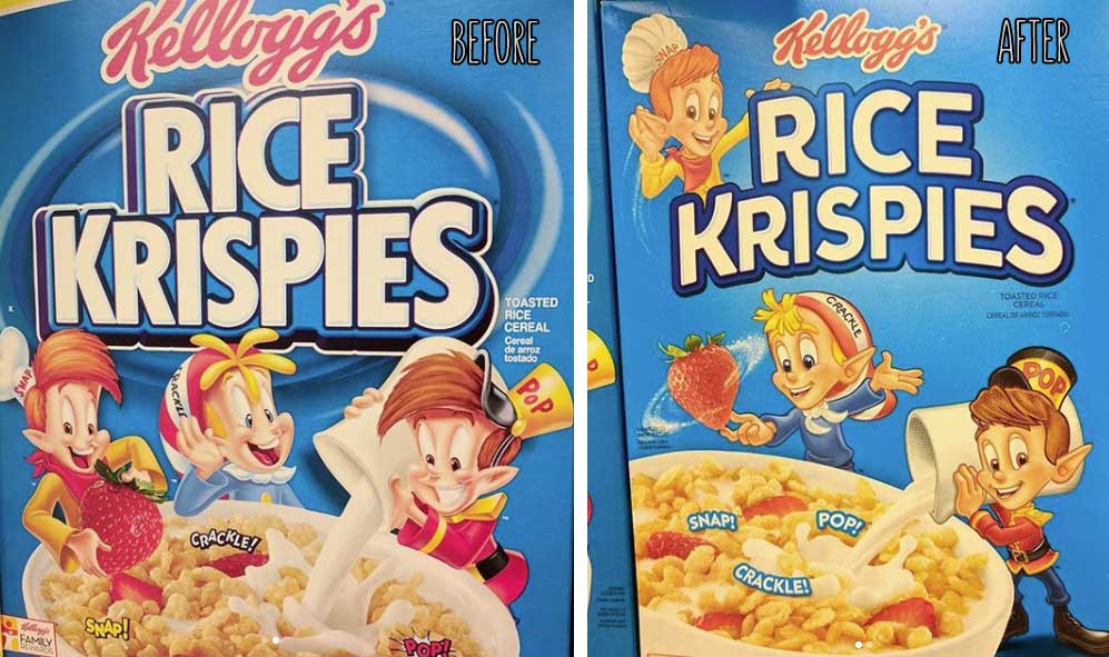
But before we judge those, let’s appraise Snap, Crackle, and Pop’s recent Rice Krispies plastic surgery, which I noticed while trying (and failing) to find those elusive new Pumpkin Spice Rice Krispies Treats.
Kellogg’s has been toying with their iconic elf trio’s appearances for a while now, giving them a”Toy Story meets Jimmy Neutron” style CGI treatment like the one Tony the Tiger and Toucan Sam have also received. But unlike Tony’s uncanny new mug, this polygonal pixie look never made it onto Rice Krispies boxes.
Instead, we’re Rice Krispies treated to a strange 2D redesign that makes Snap, Crackle, and Pop look like poorly made Millsberry avatars, ironically enough. I’m not sure whether I should put them in my pantry or in my aunt’s curio cabinet, right next to the clown statues and porcelain dolls.
Old vs. New: Which Wins?
Old, for sure. I like my eager elves to look giddy about the grub they’re mischievously adorning with milk and strawberries, not like DeviantArt characters under the influence of horse tranquilizer.
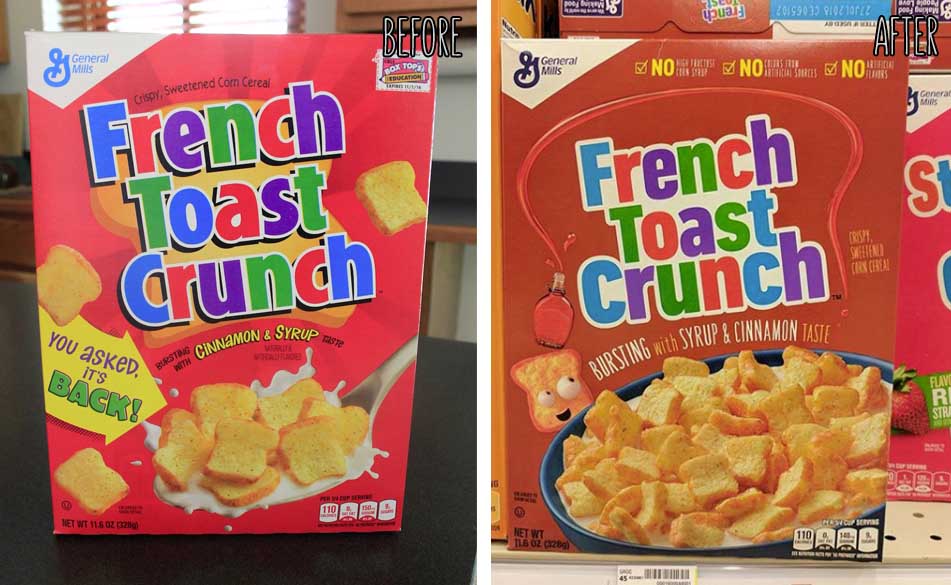
Next up is French Toast Crunch. This is by far the most dramatic cereal box change I’ve seen since Krave added more chocolate. The blaring red box we’ve nostalgically known since 1995—remember when French Toast was actually gone and everyone cried for its return? It feels like it never left now!—has been replaced by subdued, earthen tones that evoke the cozy maple syrup flavor contained in the cereal’s every crunchy bread slice.
Also new is a goofball bread slice mascot, whose eyes look like albino olives. I love him, I’m naming him Clarence, and we’re going to become an unlikely crimefighting duo.
Old vs. New: Which Wins?
As much as my inner child wants to protect the red box’s illustrious legacy, the new one just makes so much more sense. It avoids confusion with Strawberry Toast Crunch, and French Toast Clarence fits in perfectly with Cinnamon Toast Crunch’s crazy square mascots.
In fact, I can’t prove that this new mascot isn’t just a Cinnamon Toast Crunch square that studied abroad in France, became cultured, and lost his taste for cannibalistically eating his friends in favor of golden baguettes.
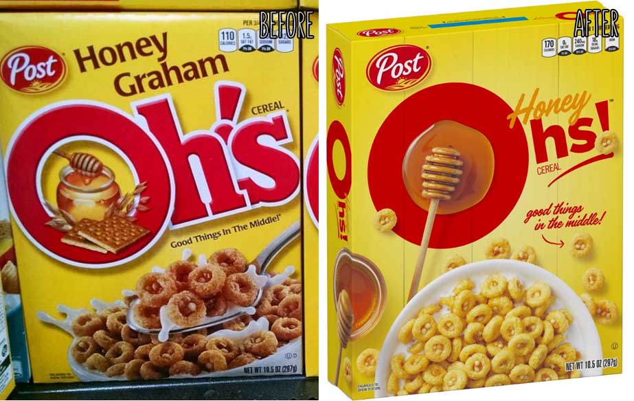
This last one might be cheating, since I haven’t found these redesigned Honey Oh’s in the corrugated flesh quite yet, but the boxes are indeed popping up in stores as we speak.
Honey Oh’s, née Graham, haven’t just gone through an aesthetic change, either. Aside from losing 33.33% of their name, these crunchy nugget-stuffed rings have also changed ingredients, with readers reporting a change in sweeteners—something Post has been doing a lot of lately. While I intend to do a full taste test soon, I can at least appraise the art first.
It’s pretty similar to the old one, but now the emphasis is all on honey, while the rings are a lot lighter—without all that wholesome dark graham flour goodness, this is only logical.
Old vs. New: Which Wins?
Old wins again. This is purely personal, but I’ve adored graham crackers since I first made a Teddy Graham maul an Animal Cracker grizzly. Seeing those blessed quadrilaterals disappear from this box makes my heart crumble like a bowl of soggy Golden Grahams, and I’m already heating up some comfort food s’mores to fill the void.
So while most of these cereal box redesigns don’t seem to be for the better, I guess that’s just the nature of time. I know I shouldn’t cling to the past, but are a charismatic Crackle and crunchy cracker really too much to ask?
If you spot a new cereal—or just a new design—feel free to send a pic on over to our Submissions page. I’d love to wax nostalgic about it here.


I am not a cereal fan but OH’s were great.i don’t understand why Post needed to change the recipe, if it was a cost factor , I think they could’ve raised the price of OH’s first to see if people still purchased the product , instead of changing the recipe and ruining a good product. In my opinion the cereal is now tasteless and too sweet , it’s like one of the store brand cereals now. A bowl of OH’s and some fresh strawberries and life was good. I have just written Post asking if they would go back to the old recipe and I’m hoping more folks do the same. I know my chances are slim that Post will ever change back but if everyone that made it here did the same , it’s a start . And if you want your friends to think you’re nuts , ask them to write a letter to change a cereals recipe. I might start a Facebook page to bring back original OH’s , it should be interesting and fun. I’m retired and have the time. So keep an eye out for the campaign to bring back our OH’s. 😛
Please start that facebook page and maybe a letter writing campaign. In the meantime, I made a change.org petition!
https://www.change.org/p/post-cereal-bring-back-original-oh-s-cereal?recruiter=899566028&utm_source=share_petition&utm_medium=email&utm_campaign=undefined
Really sad that they have changed the Honey Oh’s! It was my favourite childhood cereal growing up and it’s just not the same anymore! First it was difficult to purchase (no longer in supermarkets as of a few years ago – had to order via Amazon) and now I can’t even get the original formula! What a shame.
Wow…they really altered the Oh’s! I saw the new box and became excited. I don’t buy it often as I am a little bit of a health nut so I try to limit sugar. Anyway I used to crush these in my childhood. When I saw the new box, I never expected them to change the flavor /ingredients…nothing. I was wrong. I was so happy to sit down with a bowl of Oh’s only to discover that they changed them. For the worse. I stopped eating them and threw the rest in the trash. Why can’t they leave a good thing alone?
Congratulations… You lost a lifelong buyer. Pretty sure the objective of a business was to retain buyers… Not sure they did the right type of research.
Just ate the new Honey Oh’s. Immediately in thought there was a problem with the freshness or something, as it tasted completely different and not in as good way. I grabbed the box thinking it was just cosmetic, but low and behold Post (which bought it from Quaker) removed the Graham flour, rolled oats and other ingredients. They added in paprika and vegetable juice (that would explain the off flavors). I couldn’t even finish the bowl. Contrast that with the prior formula where I could not stop eating it. What a shame!
Well used to be one of my favorite cereal. Guess it’s off my list, taste is definitely not good.
The new OHs cereal is horrible! PLAIN and Flavorless, like chewing a bowl of cardboard with milk.
Honey Oh’s older Box is wayyy better …unfortunately have NoT had this yummy cereal for years …
You should also do a taste version…HONEY COMBS and Alpha-Bits up here in Canada have just changed…terrible flavour….many complaints to Post !!
The new Cinnabon and French Toast Crunch boxes are tugging at me. I don’t like either cereal enough to keep around anymore, but I am so drawn to those boxes.
The redesign of Snap, Crackle and Pop is awful… like REALLY AWFUL.
I don’t know who gave this design his blessing at Kellogg’s, but it must’ve been some weird old guy that had a really unhealthy relationship with Oblaten (that what we call them here in my part of Germany; not sure, but victorian scrap papers seems to fit as translation)
I mean the CGI design for Tony works pretty well and though he lost a bit of his destinctive head shape i grew up with, it’s a really good modern redesign.
The redesign of Lucky is also not that awful, if you like the minimalistic “Fairly OddParents” style, though it wasn’t really an improvement nor a worsening.
But hell… those three Rice Krispie elves somehow give me the creeps and remind me of a weird and creepy horror movie placed at the northpole around christmas…. -.-
The redesign for French Toast Crunch is AWESOME (at least in my opinion, but i don’t have the nostalgic relationship with the old design, that some of you have)! I love the fitting brown tone and the mascot, with his eyes! It’s already a favorite of mine! (and way better than the Crazy Asquares)
Oh! And wait… can your really hate this guy: [Click Me!] (Just look in his joyful and friendly eyes! ;))
I actually like the redesign of the Honey “Graham” Oh’s. They really did a great job to leave the somehow old fashioned design behind and create a much more modern one. When i was at walmart the last time and was searching the cereal aisle for the cereals i wanted to take home with me i really just noticed them by mistake (old design) – Not just because the box was way smaller than the ones it, but because the design was so… plain…
Now it’s modern and i think at least the redesign was more than necessary
(This statement is just about the design not the fact, that they maybe or maybe not get rid of the graham)
CHEERS!
They didn’t maybe get rid of the graham, the graham flour is gone. As is the brown sugar. Replaced by lower quality ingredients.
😩+😡
That’s a dumb move… another one from another huge cereal brand… -.-
So i have to cherish my first and most likely last box of Honey Graham Oh’s i got from my last trip to the us…
Thanks for confirming the worst… 🙁
The new ohs are disgusting! 18g of suger per serving! That’s more than most kids cereals! I tried it expecting it to be the same and threw the whole box away. Very very sweet it’s not a cereal anymore . Very sad
I went to three different stores the other night and picked up $40 of the old Honey Graham Oh!s lol
I’m with you on all 3 designs sir, and you echoed my thoughts well Cereal Man ☹️
No no no no no no… Honey Graham Oh!s were perfect the way they were. The box and ingredients did not need an overhaul. This news completely ruined my evening. Guess I need to stock up on Oh!s before it’s too late.
It’s so sad they don’t taste the same! I’m devastated.
I just ate a box of these and I’m so upset. They don’t taste the way they used to it. They taste like some new version of Cheerios or something. Man I love this cereal they ruined it.
General Mills would never make a gaffe like this, not with Cheerios.
Yup. Post messed up big time on this one. They took one of my kid’s favorites, also a perfectly sweetened (but not too sweet) occasional indulgence of mine and made it waaaaaay too sweet to ever enjoy if you’ve had the original. The cereal discs aren’t as lofty or crunchy and the filling in the middle is not nearly as delicious or substantial. A significant t downgrade. Not as huge a debacle obviously but I’d compare this to New Coke, in its WTF were they thinking???!!!” factor. This is a wrong that needs to be righted. Your market research folks screwed the pooch on this.
I love the new FTC box, but all the others range from meh to bad for me. The mascot for Frosted Mini-Wheats also got updated, and it’s no good. Honey Graham Oh’s and Cinnabon Cereal have had their new boxes for a while on Walmart’s online shop, but I ordered them and got old boxes. Don’t they know this is super important to a tiny subset of customers?!
Whoops, I forgot to note the horrible new Mini-Wheats mascot—though by this point my hate for him is well documented already.