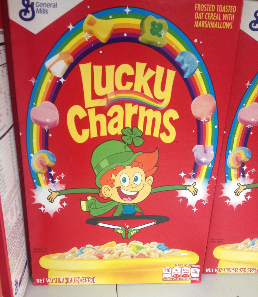
 The sugary, chalky dust has finally cleared, and the winners of Lucky Charms wildly viral Marshmallows Only contest have been named (I, unfortunately, was one of the many un-Lucky ones). Apparently looking to follow up on this fame, Lucky Charms has released a new box design, featuring a particularly cartoony and youthful design for Lucky the Leprechaun.
From his first impish design in the 1960s, to his more humanoid and recognizable humanoid form, and even through his brief replacement by Waldo the Wizard in the 1970s, Lucky has a had an impressive life cycle. It’s unknown whether this design will continue, or if it will disappear faster than a spoonful of marshmallows.
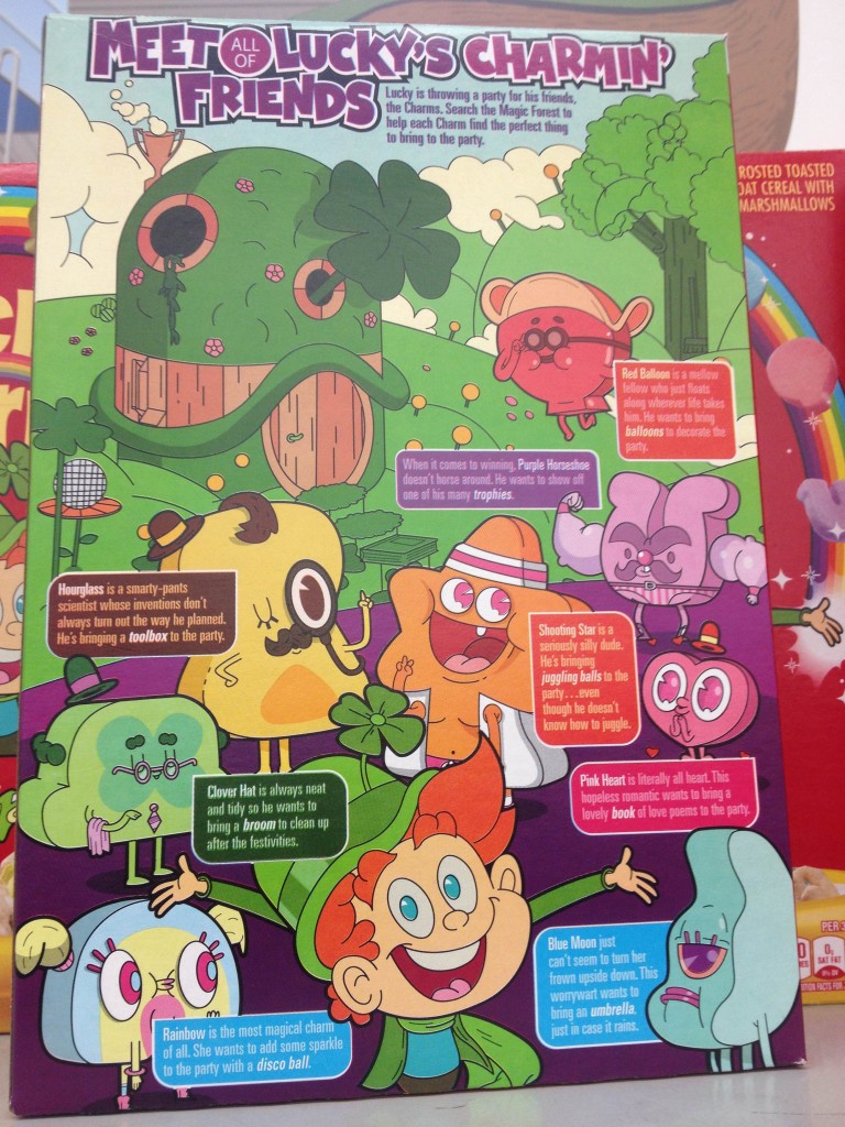
 The back of the box is even cooler: every Lucky Charms marshmallow is given their own anthropomorphized personality! I love the Adventure Time vibe I’m getting from the art style, though it does make me feel a little worse about munching through a bag of these poor souls.
So what do you think, cereal lovers? Do you find this new Lucky charming, or is the design quite sucky? Personally, I think he looks like he belongs in a Fairly Oddparents crossover episode.
If you’d like to see your picture (I spotted this at Meijer) or thoughts featured on a “Spooned & Spotted” post, click yourself right on over to our submissions page, or just email us at cerealously.net@gmail.com.


Hello. I see that you don’t update your site too often. I know that writing articles is boring and time consuming.
But did you know that there is a tool that allows you to create new posts using existing content (from article directories or other
pages from your niche)? And it does it very well.
The new articles are high quality and pass the copyscape test.
You should try miftolo’s tools
whos the illustrator of the new character?
I don’t know, sorry!
Personally, I LOVE the new design. At first I was a little iffy, because I grew up with the old Lucky, but it grew on me. Now I think it’s adorable. Plus, they didn’t actually change anything about the design, they just illustrated it in a different style—everything else, his hat, his outfit, his hair, his nose, is the same. Just in a different cartoon style—more flat, less 3-D-ish. And as for the anthropomorphic marshmallows, I LOVE THEM. My favorite’s Hourglass; probably because he’s the most like me. 🙂
Are there any artist credits anywhere?
Not that I could find, sorry. I’d recommend contacting General Mills on that one.
I don’t love this new iteration of Lucky, but I DO like the animated marshmallows on the back of the box. They’ve given them each individual personalities which is pretty cool.
Interesting! I was so excited by the front of the box that I never even thought to check out the back. I’ll have to snap a pic to add to the post next time I’m out.
But you’re right; anthropomorphized cereal pieces are always a good thing (even in the case of Krave 😏)
Personally, I think he looks like he belongs in a Fairly Oddparents crossover episode.
THIS!!! xD
Seeing th box for the first i immediately thought about all those “new” Nick Cartoons and especially Oddparents (maybe because Fairies and Leprechaun are so similar xD)
I’ve to admit, i never was a huge fan of the old on either (especially ’cause he always looked so lunatic: http://scene7.targetimg1.com/is/image/Target/12935644?wid=480&hei=480 ), but the new one is no real improvement. But no worsening either. He’s just completely different and compared to the “new” cartoony style of Cartoons these days he even looks realy good…. sooo yeah… if Lucky Charms stay Lucky Charms in taste, i can definitely live with him. (Though i will always search for his little fair wings ;))
i like the old one beter lucky charms old school